Possible Finance · 2020 to 2021
Possible Finance: A lending app designed around the people who use it
A flexible React Native design system and a new brand, built after the Series B for an audience that was stressed, busy, and often interrupted.
Project scope
- designers on my team
- 6
- systems I owned: design and brand
- 2
- platforms: iOS and Android
- 2
From application to funded, with no surprises.
-
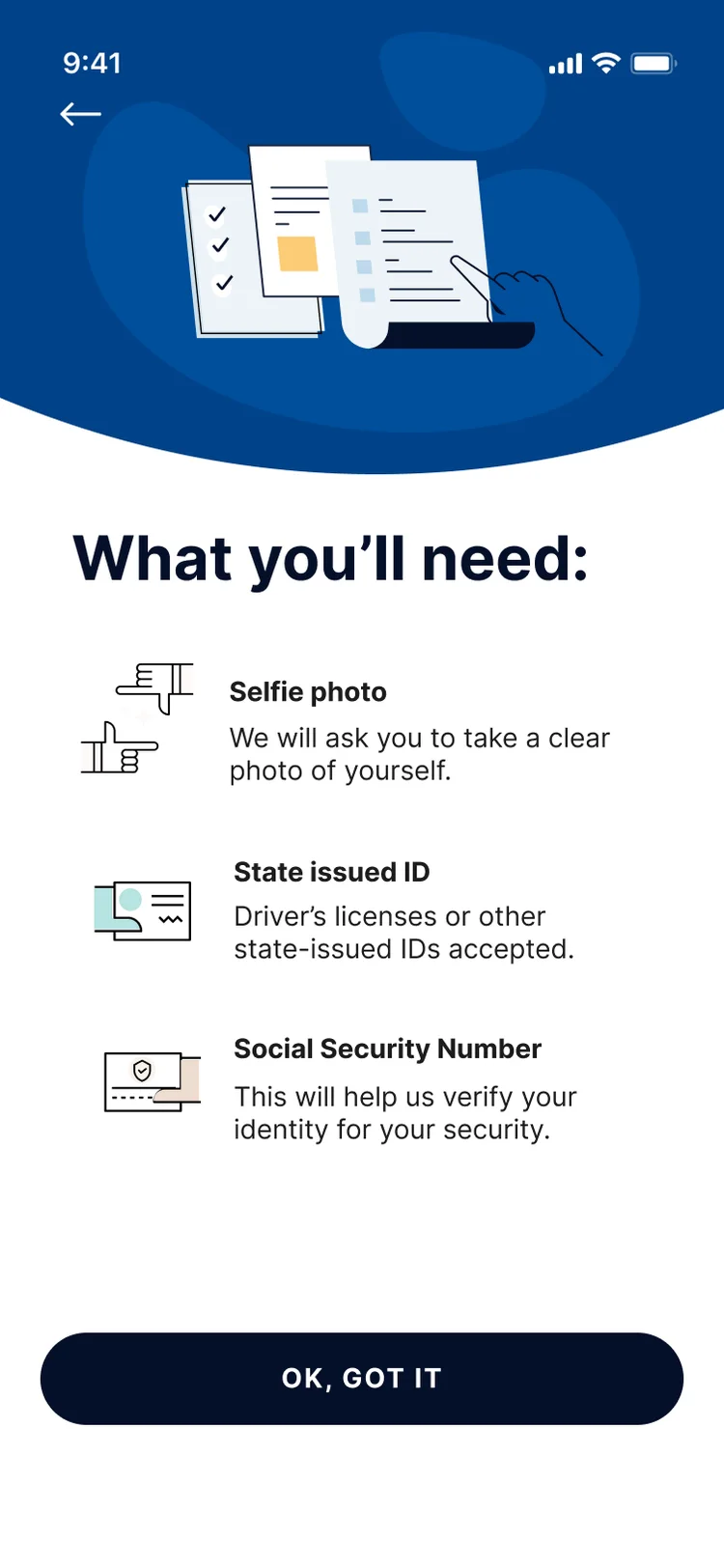
01 Prepare
Set expectations upfront: exactly what you’ll need before you apply.
-
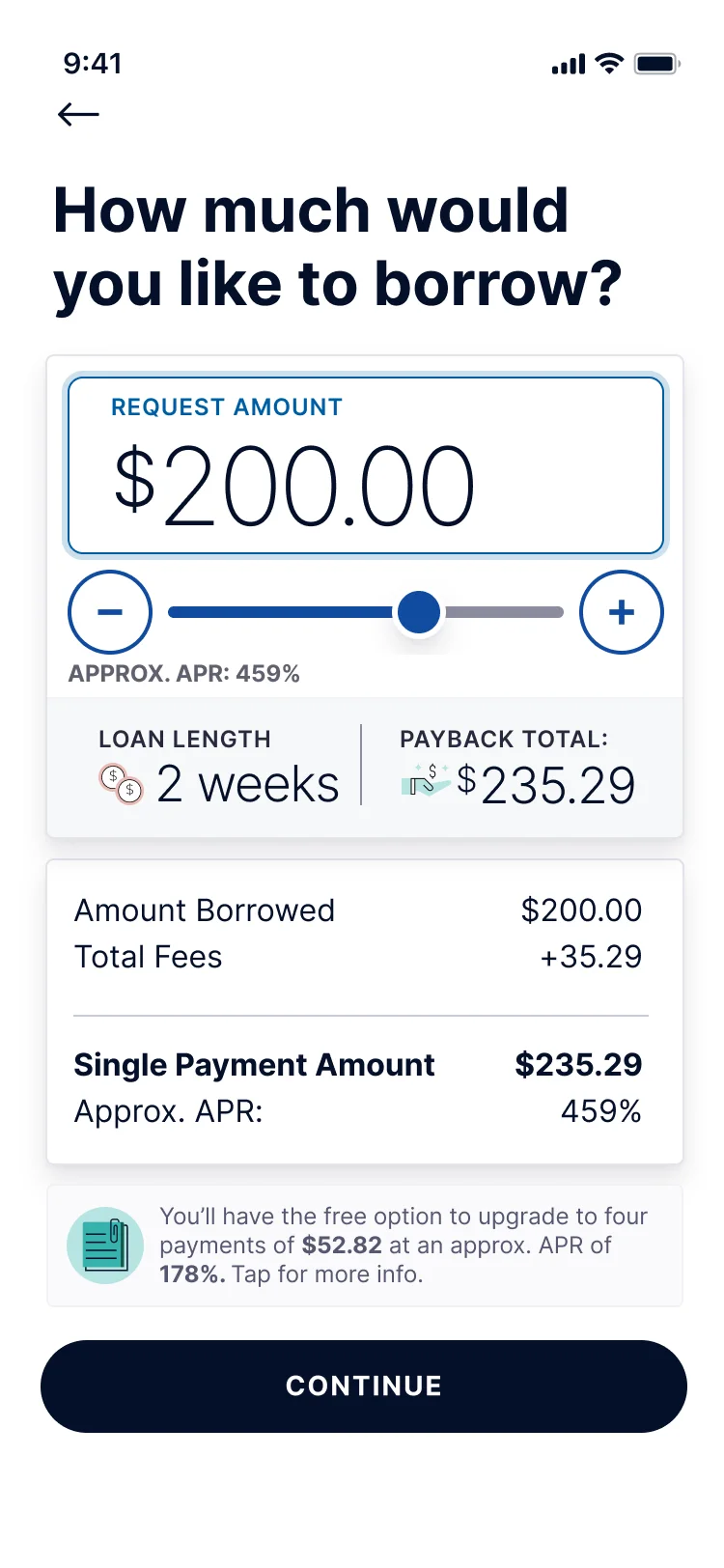
02 Borrow
An accessible slider shows amount, payback total, and APR together.
-
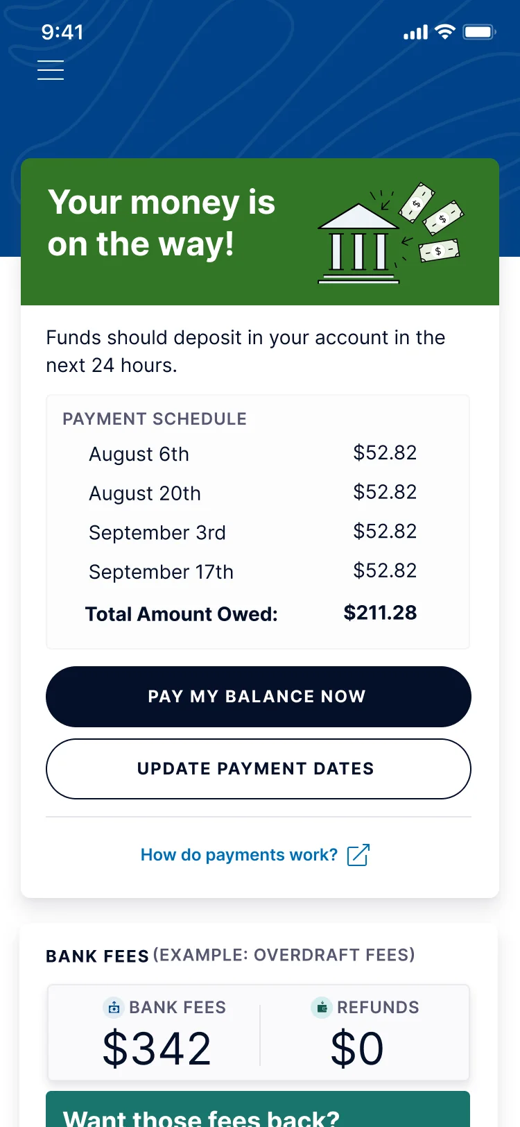
03 Get funded
Money on the way, with timing and payment controls in one place.
01 · System context
I joined Possible Finance as Director of Product Design right after its Series B. I owned both the design system and the brand, and led a team of 6 designers.
Possible offers small loans through a mobile app on iOS and Android, built in React Native.
02 · System problem
03 · System architecture
Because I owned both, the brand and the design system came from the same decisions about who we were designing for.
One system, from token to shipped screen.
- color tokens
- 84
- type styles
- 22
- elevations
- 8
- components
- 31
- variants
- 208
- icons
- 160
-
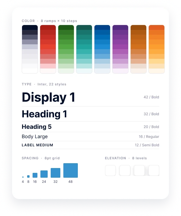
01 Foundations
Tokens
8 color ramps of 10 steps, Inter in 22 styles, an 8-point spacing grid, and 8 elevation levels.
-
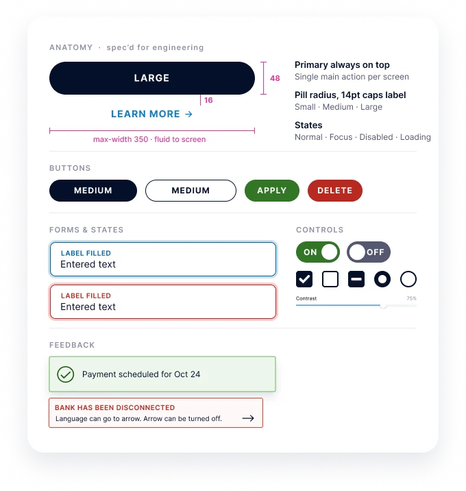
02 Components
31 components, 208 variants
Spec’d for engineering, with sizes and states for normal, focus, disabled, and loading.
-
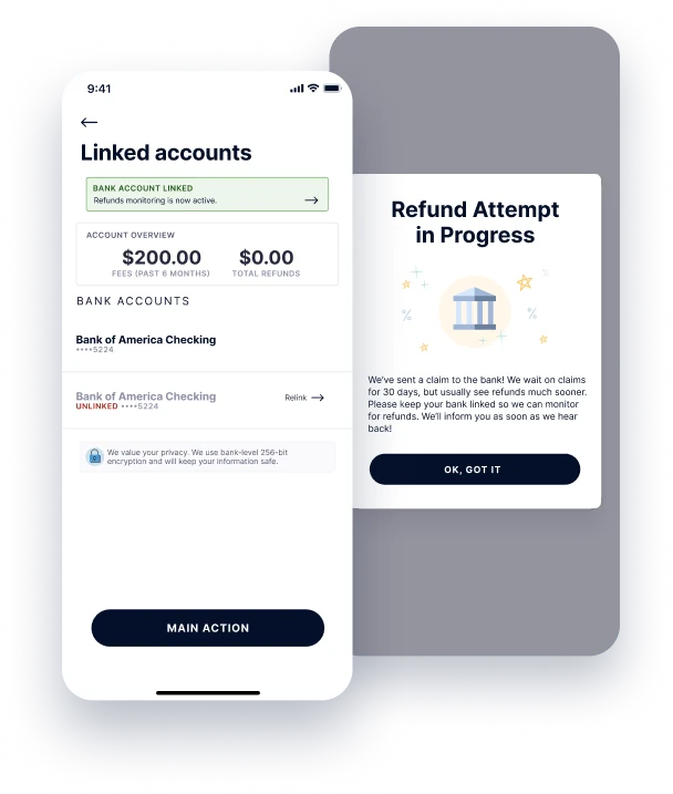
03 Product
Assembled from Core
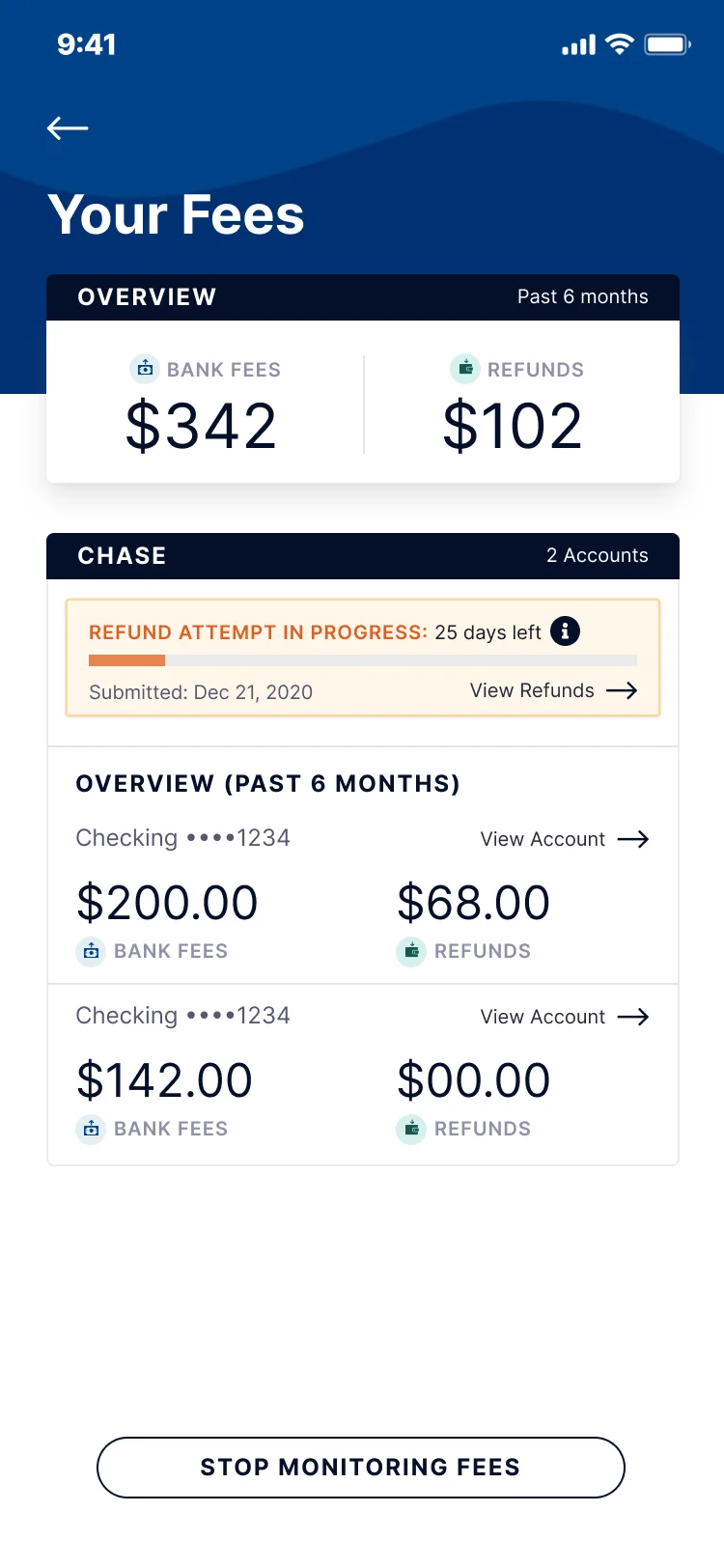
Real screens built from the same parts, like linked accounts and a refund in progress.
04 · Key decisions
- Constraint
- The experience spoke to the wrong audience.
- Decision
- Re-center the brand and the product on the people research showed were actually using the app: stressed, busy, and often interrupted.
- Tradeoff
- We gave up the original brand mark and the color orange, along with some of the “brick and mortar” payday loan feel.
- Constraint
- The experience was disjointed, with no real system behind it.
- Decision
- Develop the look and feel and the components as one piece of work, so every surface told the same story.
- Tradeoff
- For a period, the app had mismatched components while we updated it.
- Constraint
- The app relied on a lot of non-standard controls, which made tasks harder for an audience that was already stretched thin.
- Decision
- Standard React Native components, flexible enough to cover each flow without one-off controls.
- Tradeoff
- We gave up a couple of sprints to audit the app and rework it with standard patterns.
05 · Accessibility
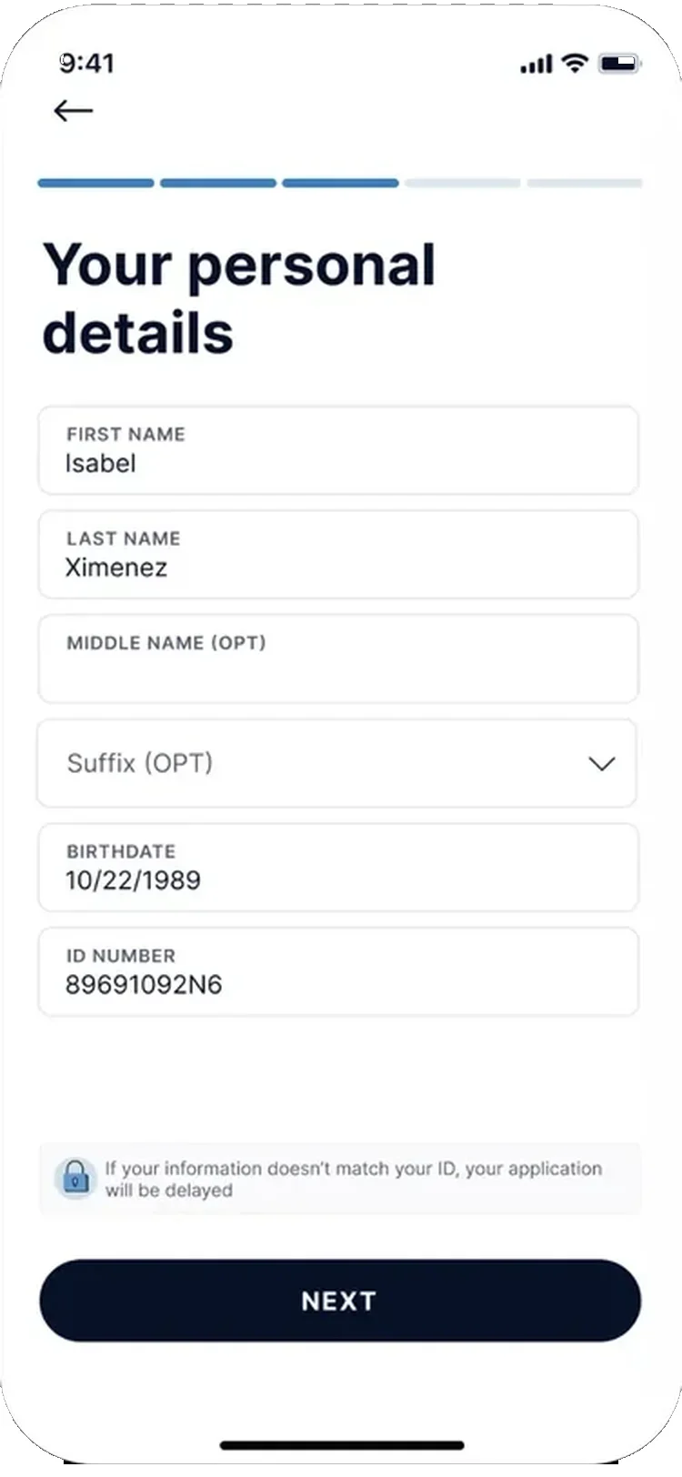
For people who are stressed and interrupted, clarity is accessibility. It was part of the look and feel, not a separate track.
- One task per screen, with progress shownEasy to pick back up after an interruption.
- Plain questions and one clear action“How much would you like to borrow?” with the total and fees right below it, and a single Continue.
- Labels stay visible, and optional is markedFields keep their labels, optional ones say so, and a short note explains what happens if details don’t match.
06 · Scaling the system
We were a startup, so anyone could contribute: designers, PMs, or engineers. When I joined, there was one core experience. By the time I left, there were three, and the system grew with each new product.
- Core experience when I joined
- 1
- Product experiences on the system when I left
- 3
07 · Adoption
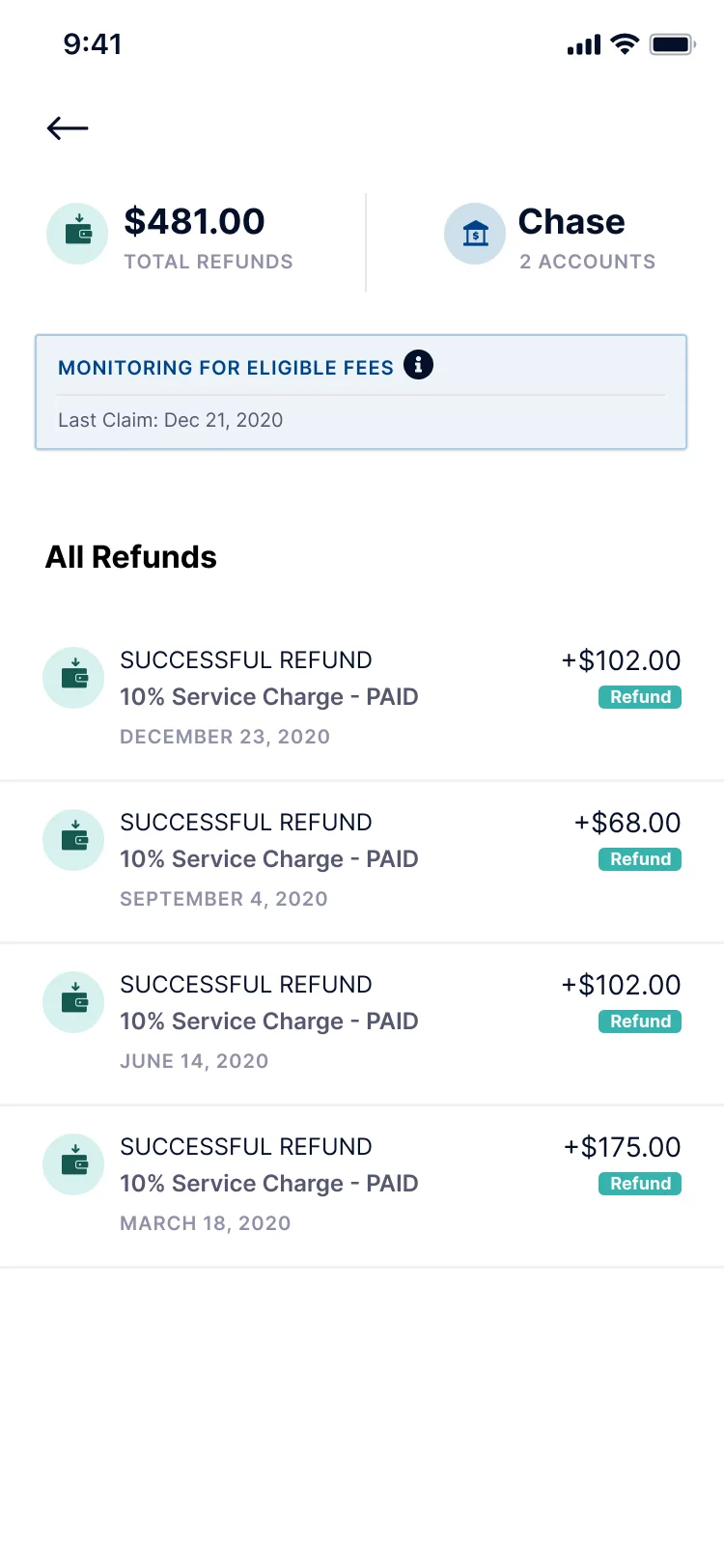
Beyond the core loan flow, Core powered Fee Finder, which finds eligible bank fees and files refund claims on customers’ behalf.
Turning bank fees into refunds, automatically.
-
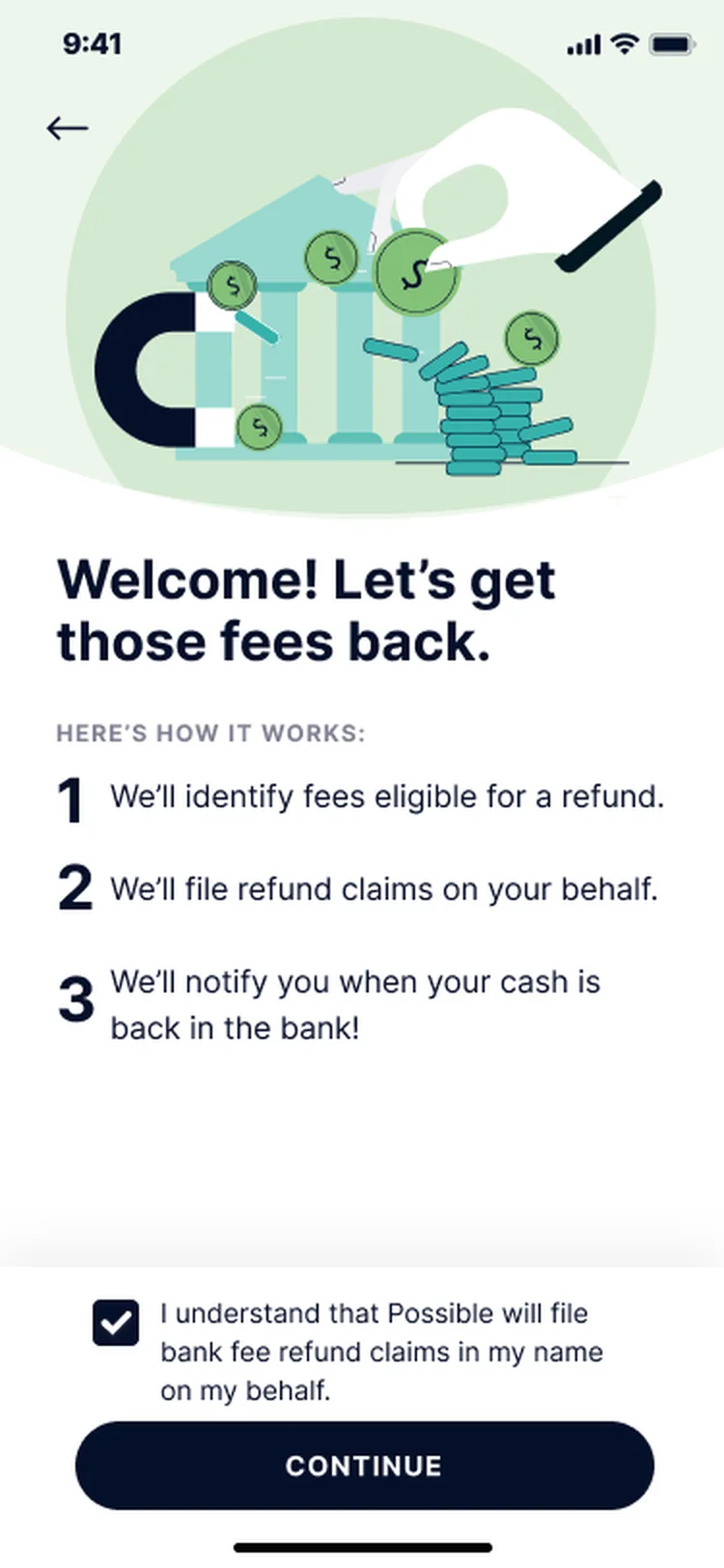
01 Opt in
Plain-language consent: how it works and what it costs, upfront.
-
02 Track
Live claim status per bank: evaluating, in progress, monitoring.
-
03 Review
Every refund and service charge itemized. Nothing hidden.
- Core flows rebuilt
- 4
- Components with accessibility built in
- 31
08 · Outcome
- Surfaces rebranded
- 80
- Audit issues resolved
- 110
What changed: One system replaced a disjointed experience. As I was leaving, an agency-led corporate rebrand arrived, built around “the everyman.” The system we built could be reskinned to carry it, without starting over.
What I’d change: I would have fought for a less heavy brand, and for more accessibility.